Color has a remarkable ability to influence how we feel, think, and behave within a space. On Hilton Head Island, where nature's palette features soft seafoam greens, warm sands, and deep ocean blues, your home's color choices can elevate not only its design but its entire atmosphere. Whether you're staging your property for sale or refreshing your forever home, understanding color psychology can help you create interiors that are both beautiful and emotionally resonant.
This guide will explore how to use color psychology to transform your Hilton Head home into a calming coastal retreat or a vibrant island getaway, depending on your style and goals.
Why Color Psychology Matters
Color psychology studies how hues affect human behavior and mood. It’s a foundational concept in design because color is often the first thing people notice when they enter a space. It can make a room feel larger or cozier, more energized or more relaxed. It can influence appetite, productivity, and even sleep quality.
In Hilton Head homes, color is particularly important because the natural surroundings already set a tranquil tone. The goal is to enhance what’s outside your windows by creating an interior palette that flows naturally from the local landscape while serving your personal preferences.
Cool Colors: Coastal Calm and Serenity
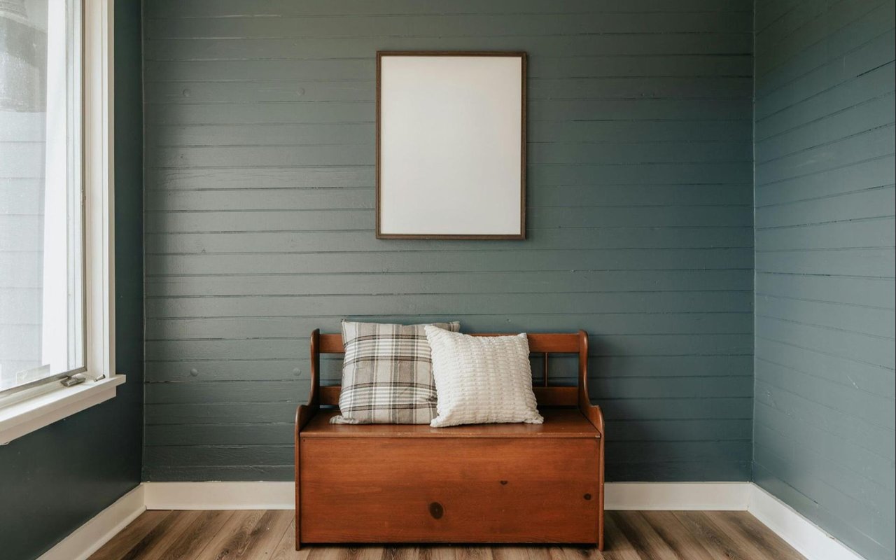
Cool colors such as blues, greens, and soft purples are widely used in Lowcountry design, and for good reason. These shades are known to promote feelings of calm, peace, and restfulness.
They work especially well in bedrooms, bathrooms, and living areas where relaxation is key.
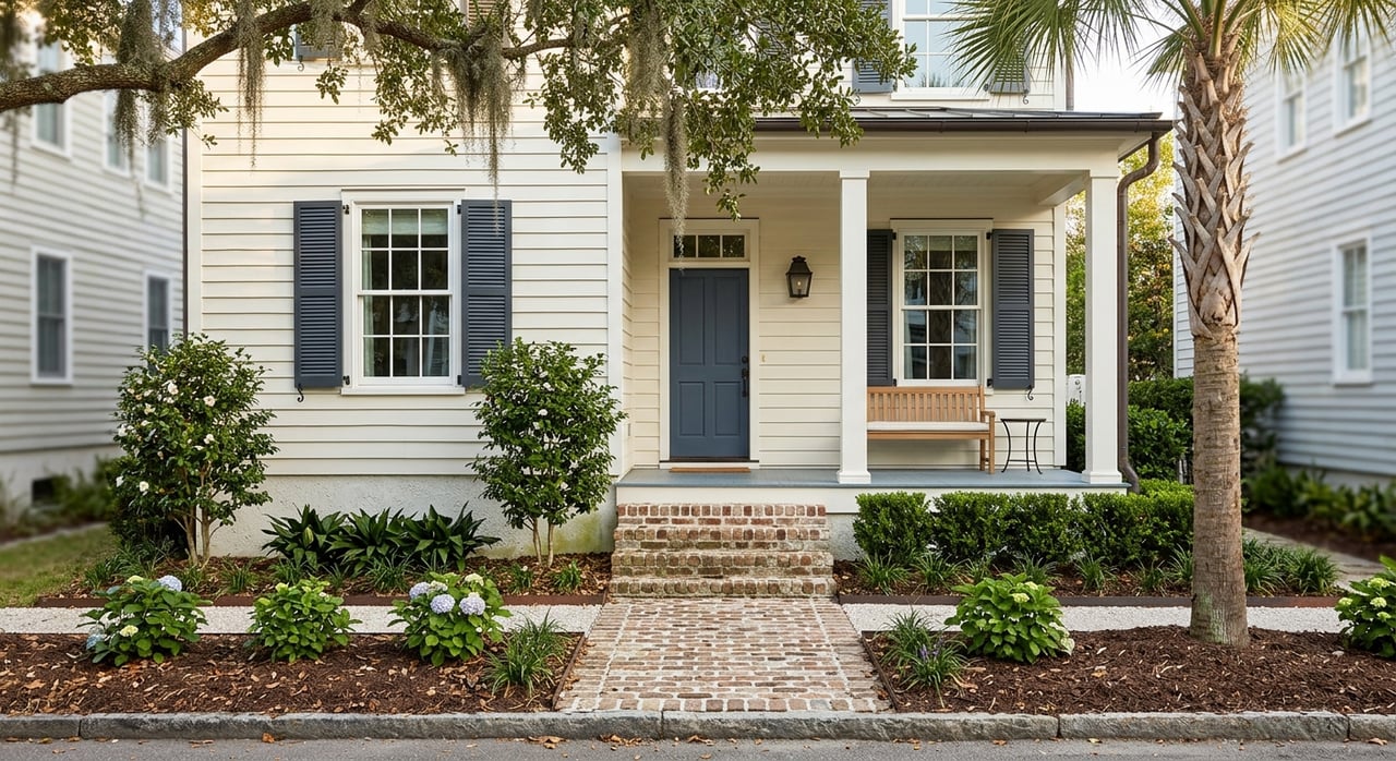
- Blue is often associated with trust, tranquility, and stability. Lighter blues, like sky or powder blue, can evoke open air and sea breezes, making them perfect for coastal interiors. Navy or slate blue can add depth and elegance, especially in dining rooms or offices.
- Green symbolizes nature, balance, and renewal. Sage green, seafoam, or light olive shades can help bring the outside in and feel especially appropriate in spaces with large windows or garden views.
- Lavender and soft purples are sometimes overlooked, but these hues can be restful and sophisticated. They work beautifully in guest bedrooms or powder rooms when paired with whites or soft grays.
When using cool tones, layering textures like rattan, driftwood, linen, or cotton helps keep the look warm and approachable rather than sterile.
Warm Colors: Energy and Sociability
While cool tones are often favored in coastal homes, warm colors can add vibrancy and personality. Think sandy beiges, soft corals, buttery yellows, or even terra cotta. These colors tend to feel friendly, inviting, and energizing.
- Yellow reflects joy, optimism, and warmth. In Hilton Head kitchens or breakfast nooks, a buttery yellow can make the space feel sunny and cheerful even on rainy days.
- Orange and coral tones encourage connection and creativity. They’re excellent choices for entertaining spaces or outdoor living areas where you want to spark lively conversation.
- Red, the boldest warm color, is often best used as an accent. A deep, brick red door or a pop of cranberry in an area rug can add richness without overwhelming a space.
Keep in mind that warm tones tend to make rooms feel more intimate. In larger open-concept spaces, this can be a great way to create visual coziness.
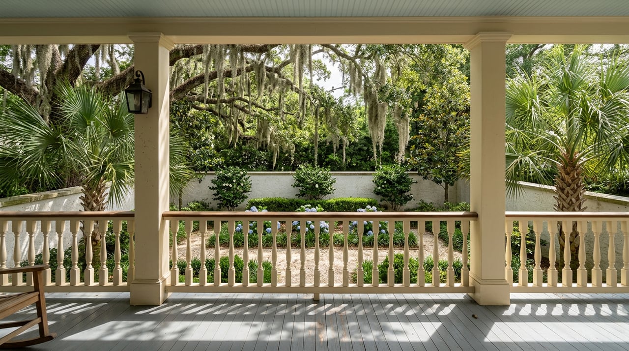
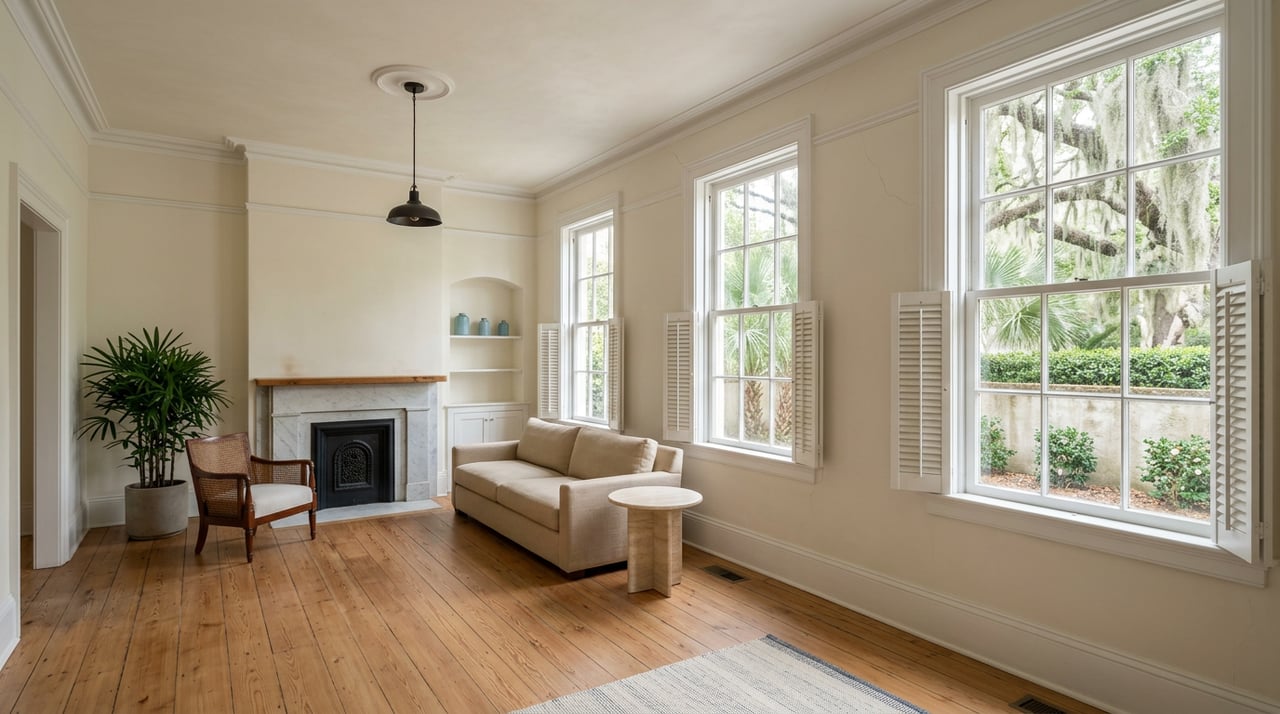
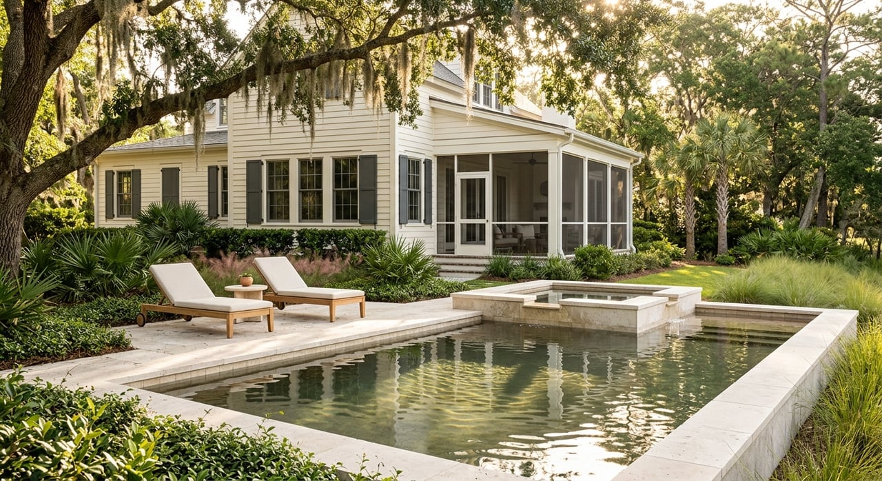
Neutrals: The Foundation of Coastal Elegance
Neutrals are the backbone of most Hilton Head interiors. Whites, beiges, grays, and taupes provide a clean, versatile backdrop that allows accent colors and textures to shine. They’re essential for creating that breezy, open look that complements island architecture.
- White promotes purity, clarity, and space. In beach homes, crisp white walls paired with natural wood or wicker furniture feel both timeless and fresh.
- Gray adds a contemporary touch and works well with both warm and cool palettes. A soft dove gray in a bathroom or bedroom can create a spa-like retreat.
- Beige and greige (a blend of gray and beige) bring warmth while remaining subtle. These tones are ideal for staging a home for sale because they feel approachable and neutral to a wide range of buyers.
Neutrals are also ideal if you prefer to switch up décor often. You can keep your walls simple and let pillows, throws, and artwork provide seasonal or trend-based color.
Color Flow: Creating Harmony Throughout Your Home
One of the keys to successful interior color design is creating flow between rooms. On Hilton Head Island, many homes have open floor plans, and abrupt color shifts can feel jarring. Instead, aim for a cohesive palette that transitions smoothly from space to space.
Start by selecting a base color for your main living area. This might be a soft blue-gray or creamy white. Then, choose complementary tones for adjacent rooms, perhaps adding a sea-glass green in the dining room and a pale sand tone in the kitchen. These slight variations keep things interesting while preserving unity.
A pro tip: carry one consistent neutral (such as white trim or light oak flooring) throughout the home. It will visually tie the entire interior together, even if each room has its own personality.
Using Accent Colors Wisely
Accent colors are your opportunity to personalize and energize your home. You can use them in artwork, textiles, or even a single feature wall. On Hilton Head Island, natural inspirations like coral, turquoise, and sun-washed pinks are always popular.
If you love bold color but worry about resale value, consider using accents in areas that are easy to update. A turquoise tile backsplash, for example, makes a strong statement but can be changed more easily than repainting an entire room. Likewise, pillows, rugs, and drapery are budget-friendly ways to experiment with color trends.
For outdoor areas, accent colors can mirror the vibrancy of local flowers or the golden hues of sunset. Think cushions in hibiscus red or planters in bright blue.
Staging with Color Psychology
If you’re preparing to sell your Hilton Head home, color psychology is even more important. Buyers form first impressions quickly, and color can subtly guide their emotional response to a space.
- Stick to light, airy neutrals to make spaces feel larger and brighter.
- Use soft blues or greens in bedrooms and bathrooms to suggest comfort and relaxation.
- Keep strong colors to a minimum and use them only to highlight features, like a striking front door or a statement art piece.
Remember that buyers are trying to imagine themselves in the space. A neutral yet coastal-inspired palette helps them do just that.
Bringing It All Together
The beauty of color psychology is that it’s both art and science. On Hilton Head Island, your home’s palette can be a powerful tool in creating spaces that reflect your lifestyle, enhance your daily mood, and connect with the surrounding coastal environment.
Whether you’re seeking tranquility, warmth, or sophistication, the right colors can help you achieve it.
Need Help Making Color Choices?
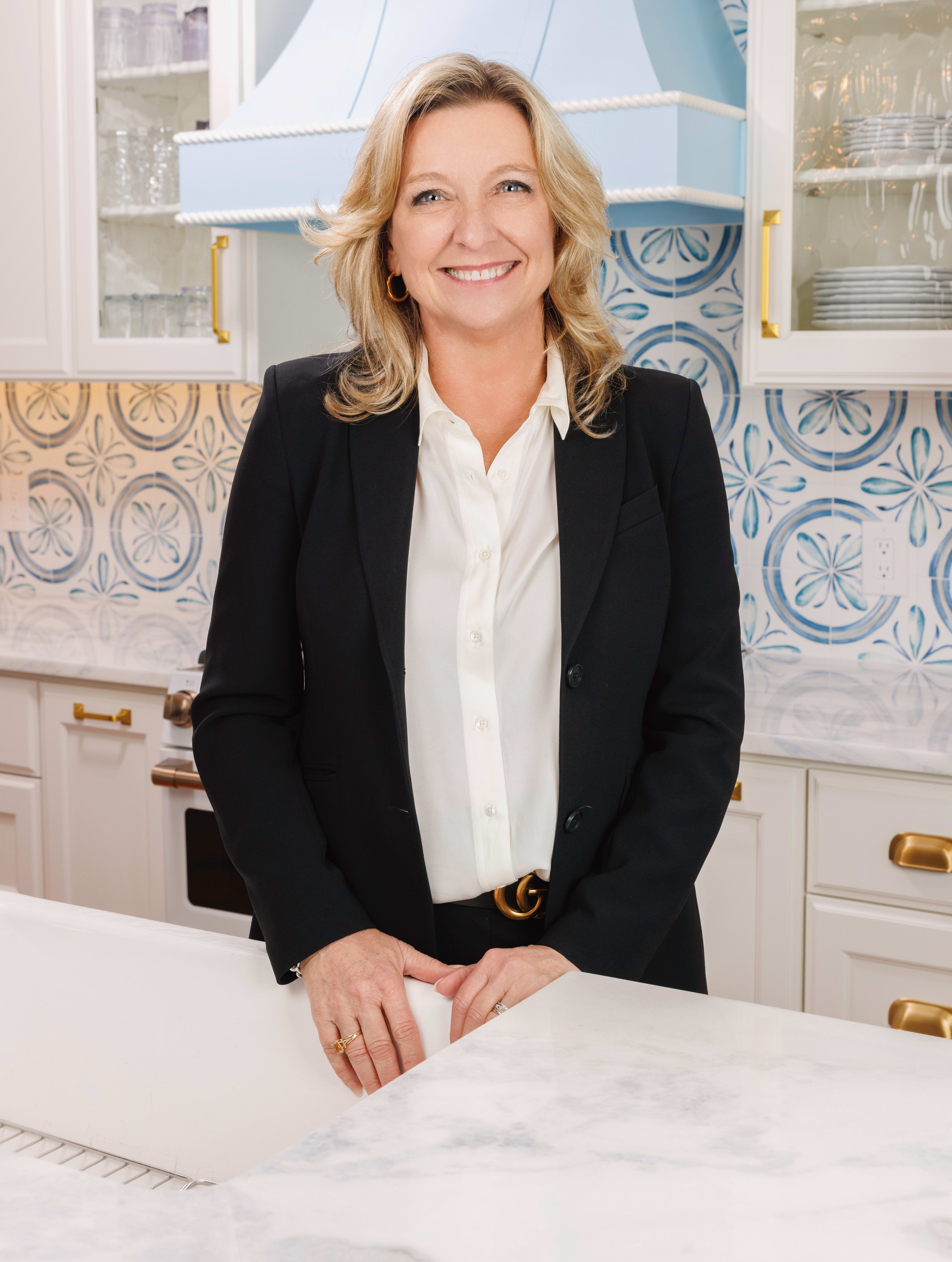
If you’re considering updating your Hilton Head Island home or preparing it for market, Karen Ryan is here to help. As a seasoned Hilton Head Real Estate Agent & Realtor, Karen offers more than just property guidance—she understands what makes homes truly shine in the Lowcountry market.
Visit karenryanrealtor.com to connect with Karen today. She’ll help you navigate everything from home staging to buying or selling with confidence and style.